Monday, September 30, 2013

Letters and Signs

Whenever and wherever I travel, I always make a point of looking at the signage and lettering - well why wouldn't I?

The Czech Republic has a great heritage of lettering and writing. From Gothic to the modern type face. I came upon many wonderful examples and am working out some ways to work ideas into new lettering forms for intriguing class projects.

Here are a few examples of what I discovered. You will see there is much scope for creative lettering. Will keep you updated
 Manhole cover
 Absinth 
 At the granite base of a memorial
 A book store
 A front door
 A cafe
 A beautiful 'G'
 A decorated 'S'
 A delightful painting at the entrance of a restaurant
 Versals describing a menu
And even he was represented: A bookstore of course

Thursday, September 12, 2013

Variety of Calligraphy

For our exhibition in November I have ensured that our guests will be amazed and delighted by the variety of calligraphic surfaces used for projects. Anything from ceramics to wooden logs.

The most important thing is that we have created some interesting pieces and with still a few surprises to enjoy before the exhibition.

 I think we will have an eclectic viewing experience for everyone.

Here are a few examples of most recent work:
 Chantal's log
 Jill's 'N'
 Jill's graphic log
 Ghita's 'S' on canvas
Ghita's flowers on pebbles

There are challenges that the artist has to deal with for the various surfaces. 
What paint to use? We used mostly acrylic inks mixed with gouache. 
Paint brushes need to be square and fine. 
Designs need to be worked so that they can be transferred from paper to surface. 
Other considerations are: will the surface hold the paint or will it run. 
How do you test the paint? 
Well hopefully you have a small little piece to test all the materials you've chosen to use.

Of course, the form of the letter needs to be as good as possible. 

I think that everyone has done her best and the standard of work is really most pleasing.

Once again, well done ladies!

Be prepared for the next classes where we will return to traditional inks, nibs and paper.

Thursday, September 5, 2013

Logging in the Studio

After a long break from official work, I have two classes to prepare for before we leave again, this time for Prague.

Our near-neighbour has been pruning. Large trees and many logs.The logs ooze resin and the cut logs are just the right surface for some creative designs. With a bit of sandpaper and strong arms we collected about 20 for the studio. I hefted about 10 of them onto tables and then gave up. Luckily Elizabeth is a strong girl and she moved more in.

The students arrived to a log-city and nearly went straight home. Luckily a few gorilla tales and strong coffee kept them indoors and we started planning the designs.

My two granddaughters were with me and I simply love the way children have a no-fuss attitude to creativity and work. When asked 'Would you like to paint on a log?' the immediate response was a short 'Yes'. No fuss. No bother.

We all looked at colour, design, shape. Using paper plates and pencils we created a vague design. Choosing colours was easy. We had acrylic paints. Gouache with acrylic ink as mixer and with a few light marks on the wood we were away.

Some people choose simple designs. Geometric and colourful. Others have grand ideas which will create another dimension to the logs and take a little longer. The granddaughters shared their favourite colours in wedged areas. Everyone created something surprisingly interesting.

Well done all. I look forward to them being placed in the garden for our November exhibition.

 Logging it
 Acrylics for the taking {Thanks Brenda}
 Tina's being created
 Jill's wedges
Rachel and Ashleigh hard at work

Thursday, August 8, 2013

New Creative Ideas

Sometimes it is too difficult to do creative work because we think we've run out of ideas. I love Pinterest simply because it has become my digital note-book. The place where I can set up boards with ideas, colors and designs which in turn set off more ideas for more creative ideas and so on.

I also find that when I am doing a commission I tend to plan the design and put off the final 'doing of it' until I create something spontaneous and feel that I can go onto the more serious task of 'work'.

This week in class I researched some other ways of creating interesting pieces which can be used for cards, notes or simply creative images.

Remember always use the best paper and tools you can to create these vignettes, you might create a masterpiece.

 Add a 'chunk' of gold to the middle of a page. Draw light guidelines around the borders. Mix a color. I used a Speedball C3 nib and wrote a quotation around the gold.
 Create an ampersand. Use black using black gouache and black ink as the mixer. Write a quotation in another color.
 Cur up letters using beautiful papers. Stick onto black paper. Add lettering if needed.
Use gouache and a thin ruling pen. Draw a few letters. Add a quotation.

Of course in all of this enjoy yourself using your well-practiced craft. Have fun.

Thursday, August 1, 2013

Flags, Flags, Flags


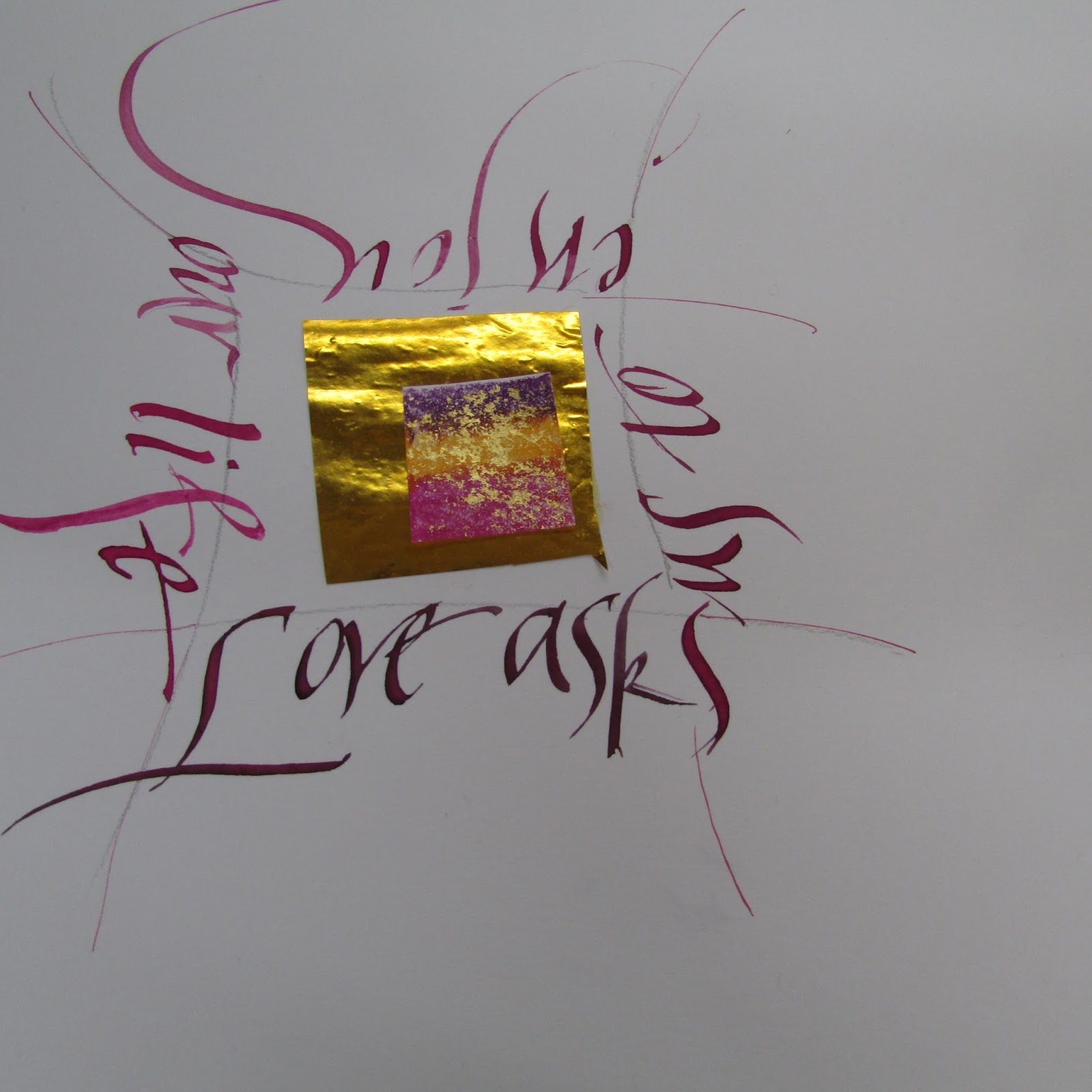
Because of our exhibition coming up in November, I am on the look out to show various projects to illustrate how versatile calligraphy is.

From writing with pen-nibs, brushes and sticks, fine letters can be created in a great variety of ways.

This week we have been writing on fabric. Here are a few ideas and tips. 


Materials: Fabric: Canvas, Calico
Square paint brushes, acrylic paint, pencils, layout paper
Plan design on a sheet of paper of similar size to the fabric.
For THIS exercise use words to do with peace or creativity
Vrede, Patz, Frio, Salaam, Pace, Friede, Kgotso, Paz, Shalom, Shanti, Thayu, Pax
Create, Enjoy, Write, Breathe, sing, think, enjoy, laugh,

Tips:
Always have a scrap of the fabric you have chosen to test the paint
When using acrylic always keep the paint wet and make sure that the paint is liquid enough to glide onto the fabric, but not too wet to leave water marks.
Use the correct size brush for size of letters
Use a simple hand: Uncial, Skeleton Romans, Neuland
Try out fabric kokis, pencil crayons
Write directly onto the fabric after your design has been chosen. If you use acrylic add a ‘liquid medium’ to allow the paint to spread more smoothly.
Choose a calligraphy marker designed for fabric or a permanent marker with a calligraphy tip. A standard calligraphy tip is broad, with a fine edge.
Use a calligraphic brush and fabric paint. This method requires a sure hand and some practice.
You could use a foam paintbrush with a fine edge. Hold the paintbrush at an angle, as you would a calligraphy pen.

Dip the brush in paint and move with the same strokes you would employ in writing. Remember that foam brushes absorb a lot of paint: use a light touch to avoid squeezing excess paint onto your design.
 Use a symmetric design
 Tina's off centre, though balanced design
 Lyn's bold gratitude
 Uncial dream
Ghita's peace


Above all… experiment and have FUN!

Thursday, July 25, 2013

Planning

Planning is so important when creating a piece. In fact we all know that the longest part of any art work it the planning. Testing pen size, color, choosing the hand and dealing with paper and paper size.

This week we have been working on creating space for ourselves on paper, to be less fearful of white paper, large nibs and knowing that leaving space to work around is optimum.

An A3 sheet of paper and handful of large nibs was the choice, together with black gouache and ink to use as the liquid to 'liquify' the  paint. This is in preparation for next lesson's writing on fabric.

Tina's work - lovely swirl and a simple quote create a beautiful image

Suggested homework: practice words depicting Penfriends Calligraphy Studio which will be paintedointo fabric and hung around the courtyard and studio as 'bunting' for the 30th celebrations in November. I'm hoping words like: Create, Laugh, Joy, Smile will be some of the thoughts that pop up - not homework, handwork and hardwork.

A rough thumbnail will be created on paper, using the same size as the intended flag, pen or brush to be used for the final piece, together with color choice and design. 

Look forward to the designs and final flags next week.

Some pieces created today which could easily be adapted into flag designs. 
 Jill's piece
 Ghita's piece
 Jeannette's cryptic quote
 Lyn's work 
Joy's piece

Tuesday, July 23, 2013

Class Homework

Sometimes (well mostly) students work diligently and quickly. For those of you who teach, you know there are always people who work much faster so extra projects need to be 'set up'.

This week's evening class is enthusiastic and all are quick workers. They have completed their 'interpretation of a poem' project (pics to follow next week) and so what to do after they have 'tweaked' their final work?

Experiment with ruling pens, Coit pens and other interesting tools of course. Here are two pieces which were done using  broad nib-pens, black gouache using black ink as the liquid (not water), short quote and a light watercolor paper. I think you will agree that the results are dynamic and successful.

 Ester's piece with 'Zen-like' space
 [the writing isn't leaning back in the actual piece - this is lens distortion]
Chantal's piece with wonderful curves
Next week's project? Peace flags...

Sunday, July 21, 2013

'Homework' by A-MM

You might or might not know that this year I have been teaching calligraphy for thirty years.

I've had much more fun than anyone involved in the 30 year war and certainly have had as much fun as anyone celebrating a thirtieth wedding anniversary, which is pearl. Pearls of wisdom I have learned and have learned much more than I have ever taught. I have {mostly} enjoyed every moment of the classes I have prepared and presented.

Penfriend's Studio celebrations are set for 20 and 21 November with wonderful workshops and surprises planned. So if you are in the area contact me.

The students have been working hard on their creative projects as well as learning new hands. I have been bowled over by their enthusiasm and commitment to the end of year exhibition. Some work in progress has been posted for your enjoyment.

As David and I go away a great deal, I decided that I should create a few small pieces, so that I too will have something for guests to view. Years ago I was fortunate to be able to go to a CLAS workshop held in Winchester and joined a creative workshop presented by Brian Walter. He taught me the joy of working small and cut me a nib from a mapping pen which I still use today.

Here is a taste of what my 'homework' has been over the past few weeks.
The pieces are small and written on those scraps of {good}paper you have in a drawer or folder.

 You Can Tell...
 Everyday
Small Things

I also collect small pieces of decorative paper and never throw away ribbon or bits of gold. I usually write in gouache and in the simplest hand. It's the quote that is important. 

Thursday, July 18, 2013

Poetry Pieces Update

It seems that giving instructions and notes about using larger sheets of paper allows students to have a heart-flutter or two. A3 paper is really only double A4 and gives marginally more space to work on. In fact, I often feel that working on A3 gives the artist space to breathe.

Today we stretched paper, created colour swatches and writing samples ready for the writing in the next few days. We used tracing paper to work out ideal placement, so hopefully all is ready to complete some great work.

We have three 'finished' pieces to enjoy. Two on canvas and one on water colour paper. Next time I will add  the the completed poems on good paper, hopefully completed and beautifully executed.

 Brenda's piece
 A-MM: Life is Beautiful on canvas - using acrylic, gouache and Chinese ink
A-MM: Live life Radiantly on canvas. Water colour, gouache, Chinese ink, walnut ink

Thursday, July 11, 2013

Poetry as Calligraphy

Calligraphers by their craft and art are word-collectors. Many words chosen are either biblical, favorite poets or words we pick up. I find that poetry sticks to me like a burr and words are an integral part of my creativity.

I love reading what other people choose. Some poems are amusing, some quirky, other phrases are though-provoking. Mostly these words reflect who the calligrapher. 

Of course in calligraphy we are interested in the interpretation of the words, otherwise why would we choose them?

My friend Lin Kerr is a great teacher and calligrapher and set me off on another journey of creativity. So often we see calligraphy interpretations of poems which are literal rather than interpretive. I have put together some suggestions on how to begin discovering alternative ways of creating unusual pieces. With the 30 year Exhibition in November I thought it would be a great idea to challenge Penfriends students.

Getting colours ready

On Poetry as Calligraphy:

Choose a poem:The words should speak to you. Remember to illustrate the words in calligraphy with a subtle indication of design. You of course will NOT illustrate the poem with a pumpkin if the poem is about Halloween.

Design, illustration, colour, lettering need to integrate and flow.
Do some research: Find at least 3 art-work ideas that you would like that you think will illustrate the poem chosen.
What materials will you choose? Paints, pens, brushes, pencil crayons, graphite.
Use: A3 layout and then stretch A3 Fabriano. Tracing paper is always good for testing layout.

Consider: If you were going to enlarge or contrast one word, phrase or sentence in the whole poem, which would it be?
Consider: Do any images, colours, jump out at you as you read the poem?
Lyn's piece

What style of lettering does the poem suggest? Italic is very versatile, Gothic marches across the page. Foundational suits classical traditional poems. Uncial is easy on the eye but a wide alphabet (so makes sentences very long) and is often used for “cute” stuff. In its proper context of course it’s a sacred script.  Never ever forget Skeleton Roman Capitals.

Consider your own style: is it cutting edge, modern, maybe chunky - Neuland perhaps? Or is it flowing and delicate? Perhaps cut letters will suit the words. Try out lettering to see which type suits the poem chosen.

Sounds are elusive think how they can be conveyed using a calligraphic style or colour. Colours may be elusive too, think vibrant colours juxtaposed. 

Important: Make swatches of colours to see what colour way and lettering will work best.

Consider the form of the poem; the poet’s layout, use of capitals etc. Are you permitted ‘creative license’? Would the poet mind if the form was changed to enhance the meaning or to allow the calligrapher to express it better?

Interview the poet if you can. The collaboration comes into it’s own if  calligraphers communicate with the poets. If the poet is long gone, imagine how and why the poem was written. 

Remember to read the poem aloud. The words will echo in your hand as you begin to write. 
Do several 'roughs'. This will help you decide on line and colour. Best if all, you will learn the poem off by heart - an added bonus. 

But most of all enjoy the creative moment. 

Thursday, June 27, 2013

Project Update

Although many 'girls' were absent today well done everyone for the great work you are doing. There is a marked improvement in writing skills and your 'layout' eyes are open and creating beautiful small word vignettes for the 'quote tins'.

I discovered the tins at Woolworths filled with soap. I thought they would make an ideal 'small quote container' and they smell good too.
 I had great fun completing my tin using coloured Canson paper and quotes found and stored for just such an occasion. I added ribbon and a small fountain pen for the recipients' own quotes and will have mine photocopied on board to fill tins with quotes for gifts.
Completed tin filled with quotations, extra paper and a small pen. I am thrilled with the results and wouldn't mind receiving one myself.

Homework:
I look forward to seeing students' completed work next week. That means concertina books as well.
Please practice writing and be prepared for another project next week.

On another tack altogether. I hardly ever (ever) have any open water or cups of tea or coffee around my work space be it computers or art work. I have been 'working hard' for the exhibition and had just cut completed pieces off the stretching board after discussing process with students.

I placed the pieces in front of me and was drinking a cup of coffee chatting to the group. I lifted the mug, only to have it slip and land neatly on my work. The result? Coffee everywhere. Of three pieces, two were salvaged. (Although one of my students gathered it out of the bin to use portion as a card - what next I wonder?).

Lesson learned? I do hope so. Luckily I'd stretched paper earlier so I took the opportunity to redo the one piece (which really does look better) and paint the other two with spilt coffee. Of course  there is not a cup or mug in sight and my painting water is in a container which is in a container. Talk about crying over spilt ink.

Was I furious and did I do a dance of absolute fury? No, what's the point? I simply removed the pieces, wiped the table and started my new projects. I truly think they look better than the originals and I will add images next week.