Showing posts with label color. Show all posts

Thursday, September 5, 2013

Logging in the Studio

After a long break from official work, I have two classes to prepare for before we leave again, this time for Prague.

Our near-neighbour has been pruning. Large trees and many logs.The logs ooze resin and the cut logs are just the right surface for some creative designs. With a bit of sandpaper and strong arms we collected about 20 for the studio. I hefted about 10 of them onto tables and then gave up. Luckily Elizabeth is a strong girl and she moved more in.

The students arrived to a log-city and nearly went straight home. Luckily a few gorilla tales and strong coffee kept them indoors and we started planning the designs.

My two granddaughters were with me and I simply love the way children have a no-fuss attitude to creativity and work. When asked 'Would you like to paint on a log?' the immediate response was a short 'Yes'. No fuss. No bother.

We all looked at colour, design, shape. Using paper plates and pencils we created a vague design. Choosing colours was easy. We had acrylic paints. Gouache with acrylic ink as mixer and with a few light marks on the wood we were away.

Some people choose simple designs. Geometric and colourful. Others have grand ideas which will create another dimension to the logs and take a little longer. The granddaughters shared their favourite colours in wedged areas. Everyone created something surprisingly interesting.

Well done all. I look forward to them being placed in the garden for our November exhibition.

 Logging it
 Acrylics for the taking {Thanks Brenda}
 Tina's being created
 Jill's wedges
Rachel and Ashleigh hard at work

Thursday, August 8, 2013

New Creative Ideas

Sometimes it is too difficult to do creative work because we think we've run out of ideas. I love Pinterest simply because it has become my digital note-book. The place where I can set up boards with ideas, colors and designs which in turn set off more ideas for more creative ideas and so on.

I also find that when I am doing a commission I tend to plan the design and put off the final 'doing of it' until I create something spontaneous and feel that I can go onto the more serious task of 'work'.

This week in class I researched some other ways of creating interesting pieces which can be used for cards, notes or simply creative images.

Remember always use the best paper and tools you can to create these vignettes, you might create a masterpiece.

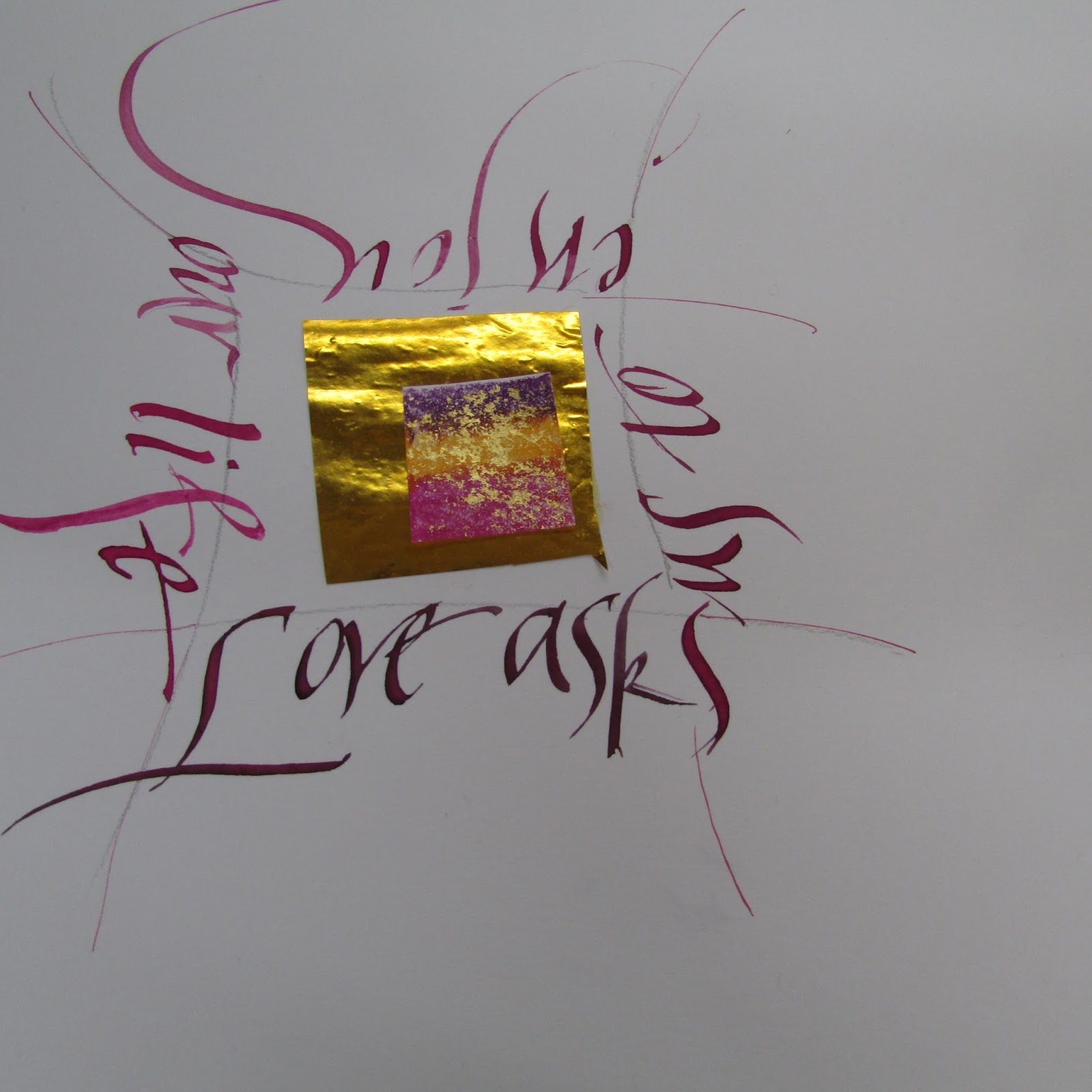
 Add a 'chunk' of gold to the middle of a page. Draw light guidelines around the borders. Mix a color. I used a Speedball C3 nib and wrote a quotation around the gold.
 Create an ampersand. Use black using black gouache and black ink as the mixer. Write a quotation in another color.
 Cur up letters using beautiful papers. Stick onto black paper. Add lettering if needed.
Use gouache and a thin ruling pen. Draw a few letters. Add a quotation.

Of course in all of this enjoy yourself using your well-practiced craft. Have fun.

Thursday, August 1, 2013

Flags, Flags, Flags


Because of our exhibition coming up in November, I am on the look out to show various projects to illustrate how versatile calligraphy is.

From writing with pen-nibs, brushes and sticks, fine letters can be created in a great variety of ways.

This week we have been writing on fabric. Here are a few ideas and tips. 


Materials: Fabric: Canvas, Calico
Square paint brushes, acrylic paint, pencils, layout paper
Plan design on a sheet of paper of similar size to the fabric.
For THIS exercise use words to do with peace or creativity
Vrede, Patz, Frio, Salaam, Pace, Friede, Kgotso, Paz, Shalom, Shanti, Thayu, Pax
Create, Enjoy, Write, Breathe, sing, think, enjoy, laugh,

Tips:
Always have a scrap of the fabric you have chosen to test the paint
When using acrylic always keep the paint wet and make sure that the paint is liquid enough to glide onto the fabric, but not too wet to leave water marks.
Use the correct size brush for size of letters
Use a simple hand: Uncial, Skeleton Romans, Neuland
Try out fabric kokis, pencil crayons
Write directly onto the fabric after your design has been chosen. If you use acrylic add a ‘liquid medium’ to allow the paint to spread more smoothly.
Choose a calligraphy marker designed for fabric or a permanent marker with a calligraphy tip. A standard calligraphy tip is broad, with a fine edge.
Use a calligraphic brush and fabric paint. This method requires a sure hand and some practice.
You could use a foam paintbrush with a fine edge. Hold the paintbrush at an angle, as you would a calligraphy pen.

Dip the brush in paint and move with the same strokes you would employ in writing. Remember that foam brushes absorb a lot of paint: use a light touch to avoid squeezing excess paint onto your design.
 Use a symmetric design
 Tina's off centre, though balanced design
 Lyn's bold gratitude
 Uncial dream
Ghita's peace


Above all… experiment and have FUN!

Thursday, July 11, 2013

Poetry as Calligraphy

Calligraphers by their craft and art are word-collectors. Many words chosen are either biblical, favorite poets or words we pick up. I find that poetry sticks to me like a burr and words are an integral part of my creativity.

I love reading what other people choose. Some poems are amusing, some quirky, other phrases are though-provoking. Mostly these words reflect who the calligrapher. 

Of course in calligraphy we are interested in the interpretation of the words, otherwise why would we choose them?

My friend Lin Kerr is a great teacher and calligrapher and set me off on another journey of creativity. So often we see calligraphy interpretations of poems which are literal rather than interpretive. I have put together some suggestions on how to begin discovering alternative ways of creating unusual pieces. With the 30 year Exhibition in November I thought it would be a great idea to challenge Penfriends students.

Getting colours ready

On Poetry as Calligraphy:

Choose a poem:The words should speak to you. Remember to illustrate the words in calligraphy with a subtle indication of design. You of course will NOT illustrate the poem with a pumpkin if the poem is about Halloween.

Design, illustration, colour, lettering need to integrate and flow.
Do some research: Find at least 3 art-work ideas that you would like that you think will illustrate the poem chosen.
What materials will you choose? Paints, pens, brushes, pencil crayons, graphite.
Use: A3 layout and then stretch A3 Fabriano. Tracing paper is always good for testing layout.

Consider: If you were going to enlarge or contrast one word, phrase or sentence in the whole poem, which would it be?
Consider: Do any images, colours, jump out at you as you read the poem?
Lyn's piece

What style of lettering does the poem suggest? Italic is very versatile, Gothic marches across the page. Foundational suits classical traditional poems. Uncial is easy on the eye but a wide alphabet (so makes sentences very long) and is often used for “cute” stuff. In its proper context of course it’s a sacred script.  Never ever forget Skeleton Roman Capitals.

Consider your own style: is it cutting edge, modern, maybe chunky - Neuland perhaps? Or is it flowing and delicate? Perhaps cut letters will suit the words. Try out lettering to see which type suits the poem chosen.

Sounds are elusive think how they can be conveyed using a calligraphic style or colour. Colours may be elusive too, think vibrant colours juxtaposed. 

Important: Make swatches of colours to see what colour way and lettering will work best.

Consider the form of the poem; the poet’s layout, use of capitals etc. Are you permitted ‘creative license’? Would the poet mind if the form was changed to enhance the meaning or to allow the calligrapher to express it better?

Interview the poet if you can. The collaboration comes into it’s own if  calligraphers communicate with the poets. If the poet is long gone, imagine how and why the poem was written. 

Remember to read the poem aloud. The words will echo in your hand as you begin to write. 
Do several 'roughs'. This will help you decide on line and colour. Best if all, you will learn the poem off by heart - an added bonus. 

But most of all enjoy the creative moment. 

Thursday, June 20, 2013

Quick Concertinas and Homework

Well, if you are a true bookmaker there is never anything like a 'quick' anything, but concertina books can be quickly made for a card or a gift. A more ambitious creation can be turned into a beautiful quote book with decorated letters which is what the Penfriends students have been working on for the past few months.

Of course, making a cover for the books can be tricky, unless (again not if you are a meticulous book-binder) you take it step by step and are not too worried about perfect touching corners. I feel that most times the good pages cover the imperfections and for our needs works well.

Here are a few pointers:
Choose paper that is not shiny and suitable for the quotations chosen taking into account the words and colours used. I find that scrapbooking paper is great. Cut two covers out of mount board or similar firm cardboard, about 1 centimeter larger than the actual book. Cut the cover paper about 2 cms larger than the board.
 Place the board with a 2 cms border of cover paper onto the decorative paper. Score against the edges of board with a bone folder or awl.
 Fold the corners at right angles to the board. Fold.
 Cut the corner a little away from the fold.
 Corner nearly perfect.
 To stick the book together we used double-sided tape. Place the cardboard over the stripped tape. Then use strips of double sided tape for the sides of the paper, folding the paper into the card. Use your bone folder to 'crisp up'.
Place concertina book on covers. Add ribbon between the back cover and book or add after the book is complete. The choice is yours.
And here is Jeannette with here nearly completed concertina book! Note ribbon under left hand. It is secured between the back page and book and will wind around the closed book to finish it off.

Homework for all:
Complete book covers for concertina books.
Bring heavy card for portfolios.

Tin Quotes
Prepare paper for small tin boxes. 7x11 cms size is ideal. Round the corners if you would like to.
Please remember you will need to make sure that nib sizes and quotes fit onto the page. Remember to leave a border around each written piece.
Be aware of ink/gouache colour.
If you draw lines on your paper take care to be light handed.

It is a good idea to do a few layouts [thumb nail sketches] so that you have an idea of how your writing progresses.

Suggested ideas for working the various quotes.
1] Take a quote and find a word to highlight. Use capital letters for this word.
2] Take a quote and use 'Boustrophedonic' style writing.
3] Brush lettering for one or two words.
4] Stacked Roman Capitals [pencils?].
5[ Italic Flourish.
6] Foundational.
7] Compressed.
8] Your own choice.
9] Don't forget a cover.

Please remember Wednesday 10 July: Calligraphy on Canvas
All day workshop: 9h30 - 16h00
R200 which includes tuition and refreshments.
Booking essential.

Until further notice Tuesday morning group will amalgamate with the Thursday morning group.
9h30 - 12h00.

Happy working and remember this quote from Salvador Dali: 'Have no fear of perfection, you'll never reach it', so we are all off the hook!


Saturday, June 8, 2013

Homework and Other Creative Things

We all know that practice experimenting are the best ways to further the discipline we have chosen to follow.

My son John is an artist and draws every day. He carries a creative notebook with him all the time and makes notes continuously. My other son Dave is a paediatrician and in research and continues to probe, ask questions and make notes continuously. David, my husband, is a great photographer and always carries his camera with him - who knows what will catch his eye? Elizabeth our daughter is studying and is required to research and read continuously.

While this sounds like a litany of my family's work what I am illustrating is that no matter what you choose to do, an enquiring mind is how one is able to continually be creative. Creativity doesn't ever come to an end. The more you follow your passion, the more you will find.

From now on I sill be adding homework set during class to the blog so that everyone can follow progress in-between other posts.

Lyn's Abstract Piece

We are working towards the Penfriends Calligraphy Studio 30 year celebration in November. So creative work is being encouraged and completed.

We are making Portfolios for loose leaf work and for long-standing students, we encourage them to go through years of work so all can see the variety of hands and work that has been created.

Portfolios for your own exquisite work for the exhibition:
Requirements: Canson A1 sheet. The heavy weight Canson. Colour of your choice
Gros grain ribbon

Over the years we have made several small concertina books. This year we created some exquisite decorated letters with words to match. These now have to be covered.
Cover for Concertina Books:
Requirements: Use the backing page from any of the pads you use for practice
Cut 2 pieces 1/5cm larger than the size of your book. [Front and back cover]
Find paper suitable for your book which will cover the above pieces of cardboard
Gros grain ribbon 

I am always on the look out for various ways to create new ideas. Woolworths has some beautiful tins with soap inside. We have given the soap away and will be making pages using different lettering and quotes about art and calligraphy.
Tin books:
Choose 5 Canson colours [A4 is fine] that match the tin you have chosen
Cut 10 pieces - 2 of each colour 1/2 cm SMALLER than the size of the tin. 2 pages will be the front and back covers.
It is a good idea to have a template, try it out first and then cut.

This was an inspiration from a friend of mine Paddy. She gave me a series of 6 blocks for each student. We painted these a neutral colour and created abstract designs, using the calligraphic stroke as inspiration, from images found in magazines. We had some wonderful results.
Abstract design [Blocks}
Final decision re mounting the blocks: 1 piece BLACK mountboard 37cmx26cm [Any framer should be able to assist]
Double sided tape
Please mount your original 'inspiration' and 6 block-practice paper onto an A3 piece of paper [neutral colour]

And of course there is always Lettering. The reason we go to calligraphy classes. At the moment we are looking at Uncial and Compressed with wonderful reference material from Sheila Water and Edward Johnston. What a challenge we have.
Lettering:
Please practice Compressed/Uncial
Note the shape of the 'O' and then the other letters will follow.
Please find quotes on Art, Calligraphy, Lettering

Next week I will continue with each group's homework and progress. 
Happy creating