Tuesday, June 8, 2021

Paper, Pens & Inks

 The other day someone asked what paper I prefer using. A very good question but it set me thinking...

When we first started calligraphy in South Africa about 40 years ago our first 'overseas' teacher was Tom Gourdie who was the gentlest and dearest person you could meet, but he simply loved letters and talking letters and frankly, I have little recollection of the classes except smiling a great deal and wondering what I was doing there. Shortly after that Denys Taipele joined us from the US and turned the calligraphy world on it toes. She introduced us to Fabriano (I think we had to have it imported), Winsor and Newton gouache and most importantly 'Beautiful Writing'. I remember doing Italic flourishes with her and having a few conniptions while attempting a beautiful swirling 'g' for a piece which was part of a series we created for a children's oncology ward. It was a poem about clowns which rather daunting, but as I recall the pictures were more colour than clown faces. But the exercise allowed us to think about patter, design and most importantly letterform.

What has this got to do with paper choices? Well, the choice is wide and bewildering and you have to experiment. Many times and very often. Ask ANY calligrapher what their favourite paper is and each one will give you a few different responses.

I have an array of paper which I love to use and it all depends on what I am going to write, draw, paint which paper I choose. What pens or brushes I am using and whether I will use graphite or not. And yes, the choice is endless - so is the amount of fun you can have exploring.


I use D'Arches paper (very expensive cloth paper. VERY nice to work on). Fabriano is a good 'all rounder'. Amadeo is good for practice. Bockingford and Canson are great standbys. But what weight will I use? 180gsm or 300gsm? Am I using Noodler ink to draw with or will I paint and add ink afterwards? And so on.

The choices are multiple and pretty much endless.
The solution? Order paper, paint or ink sampler packs. Most good stores/makes have such packs so that you can test which works best for your needs.

There was a moment sometime last year when I thought I might run out of paper. Well I hope you didn't hold your breath as I found stacks of paper in the studio with enough ink to float a boat as well. I also discovered 4 full sheets of D'Arches and felt so generous I passed some onto John. I will never be able to use up all the bits and pieces I have in my drawers and cupboards. But what fun I have 'trying' out.


So the short and simple answer is experiment. Buy a few sheets of beautiful paper. Find some paper packs. Make a paper note book (I'm sure some of you have the beginnings of one). Note the materials you use so that you have a reference for future projects. (This does not need to be a dissertation, simply a few pointers).

Most of all ENJOY your experimentations. I certainly do.

Saturday, May 29, 2021

Planning Ahead

As a teacher, new sessions are needed to be prepared continuously and half the joy of teaching is preparing new and stimulating exercises for students.

Through teaching I have meandered many varied paths which have been both challenging and exciting. 

Denys Taipele started many of us on a painting path and I have my 'water-colour bible' filled with many exercises which helped expand my creative journey exponentially. 

With numerous teachers and varied teaching methods over many years I have built a creative repertoire of skills to pass onto my students and create moments of awakening and delight. 

At the moment I am about to tutor someone in watercolours who has never done art before apart from school art. If his experience of school art was anything like mine, I am surprised he wants to embark on this journey. The interesting thing is that instead of trusting the teacher's guidance and suggestions on materials he has a question for every instruction and request. While it is admirable to be inquisitive, to question every detail at every turn can become exhausting-and this is before sessions have started. Instead of believing in the process, he seems to be putting up road blocks at every turn. So this will be a challenging journey in many aspects but hopefully some great positive will result.

Experimenting with Water-Colour

An unusual combination

New sessions planned for August

Using the Letters and Ideas from previous Courses we will create a 26 letter Book of Days with a theme using appropriate quotes and letterforms. 

16 Weeks long: R700 every 4 sessions
This will incorporate letter form, painting, design and layout.
Booking essential
***
Proposed Dates:
Tuesday: 3, 17, 24, 31 August, 7, 14, 21, 28 September, 4, 11, 18, 25 October
Thursday: 5, 12, 19, 26 August, 2, 9, 16, 23, 30 September, 14, 21, 28 October
***
I will be planning a small book of days with various A-Z names for my two littlest grandchildren.

This is the small A6 book with watercolour paper pages which I have already evenly divided into pages which I shall write on and illustrate. I think this will be a great project to end the year. 
***
November: Colour in Calligraphy
Four weeks of creative inspiration
Tuesday: 2, 9, 16, 23
Thursday: 4, 11, 18, 25


Saturday, May 22, 2021

Five Minute Challenge

 With so much time spent at home and in my new studio space upstairs I am able to compartmentalise time. Perhaps more efficiently because I am not 'popping here and popping there' for a coffee, chat or visit.  So time is spent (usually) in a more orderly fashion. 

I've done over 365 daily quotes over the past year or so and use various techniques from watercolour to graphite. Pen and brush. Pencil crayon to fine drawing and have loved all the techniques I've rediscovered.

I often set myself 5 minute challenges and suggest it is a wonderful way to make goals for both new ideas in lettering, technique and creativity:

Materials: Good paper, selected pens nibs: round and fine. Colour. In this piece I used Faber Castell, Albrecht Durer watercolour pencils which give vibrant colour and can be wet to create a 'water-colour' mixing effect. 

With Pen and without
I used a pencil to outline the design. Added marks with the B series round nib. Drew the designs with a fine nib and then, once dry added coloured pencil marks. I then used a paintbrush to brighten the colours.

Set yourself time to complete this. Before you start, be aware of how your materials so that everything is at hand. Be focussed and as ever always remember to breathe. 

Create more of these exercises to do. You will be delighted by the creative moments you will enjoy.

Sunday, May 16, 2021

 After many days, months, years, I am resuscitating this blog which I'm sad to say I'd forgotten I'd started and found by accident recently.  

For the meantime I will add my upcoming classes which will be fun and enjoyable as we discover and collect beautiful letters to make up an alphabet that each person will collect and cherish. 

An 8 week course on The Development of Letterform: 
Creating a Perfect Alphabet Letter by Letter.
Tuesday morning & Thursday evening
Both groups will be doing The Mystery of the Alpha Bet. 
R700 for 4 sessions payable in advance.
Tuesday morning 10h00 to 11h30: 
11, 18, 25 May 1 June & 8, 15, 22, 29 June
Thursday evening 17h00 to 18h30 
13, 20, 27 May, 10 June & 17, 24 June 1 July
This will be an interesting and enjoyable journey as we explore the development of letter form & how to create our own 'Perfect Alphabet'.
We will re-look at various alphabets and hone our skills using 2 weeks each for Uncial, Foundational, Gothic & Neuland, Italic & Modern. 
An understanding of letterform and calligraphy is recommended.
As always booking or confirmation is essential. All notes and connections will be sent before each session. 

On a book sale some time ago, I found a fascinating book on the alphabet (well how can you resist a book about letters?) called appropriately Letter by Letter with a sub-title An Alphabet miscellany. The ideal book to dig and delve into to find a perfect letterform. Each letter is discussed and tracked from the origins and is rather fascinating. We all know that Aleph is the first letter (in the Western world anyway - don't let's even consider going further than the Mesopotamian valley. And the book just adds bits of knowledge with beautiful letters to marvel over.

In time I will add creative challenges, calligraphy bits and pieces and some added information as I discover something new and different. 

In the meantime enjoy a break and always remember to breathe.


Monday, September 30, 2013

Letters and Signs

Whenever and wherever I travel, I always make a point of looking at the signage and lettering - well why wouldn't I?

The Czech Republic has a great heritage of lettering and writing. From Gothic to the modern type face. I came upon many wonderful examples and am working out some ways to work ideas into new lettering forms for intriguing class projects.

Here are a few examples of what I discovered. You will see there is much scope for creative lettering. Will keep you updated
 Manhole cover
 Absinth 
 At the granite base of a memorial
 A book store
 A front door
 A cafe
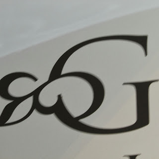
 A beautiful 'G'
 A decorated 'S'
 A delightful painting at the entrance of a restaurant
 Versals describing a menu
And even he was represented: A bookstore of course

Thursday, September 12, 2013

Variety of Calligraphy

For our exhibition in November I have ensured that our guests will be amazed and delighted by the variety of calligraphic surfaces used for projects. Anything from ceramics to wooden logs.

The most important thing is that we have created some interesting pieces and with still a few surprises to enjoy before the exhibition.

 I think we will have an eclectic viewing experience for everyone.

Here are a few examples of most recent work:
 Chantal's log
 Jill's 'N'
 Jill's graphic log
 Ghita's 'S' on canvas
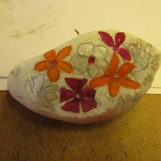
Ghita's flowers on pebbles

There are challenges that the artist has to deal with for the various surfaces. 
What paint to use? We used mostly acrylic inks mixed with gouache. 
Paint brushes need to be square and fine. 
Designs need to be worked so that they can be transferred from paper to surface. 
Other considerations are: will the surface hold the paint or will it run. 
How do you test the paint? 
Well hopefully you have a small little piece to test all the materials you've chosen to use.

Of course, the form of the letter needs to be as good as possible. 

I think that everyone has done her best and the standard of work is really most pleasing.

Once again, well done ladies!

Be prepared for the next classes where we will return to traditional inks, nibs and paper.

Thursday, September 5, 2013

Logging in the Studio

After a long break from official work, I have two classes to prepare for before we leave again, this time for Prague.

Our near-neighbour has been pruning. Large trees and many logs.The logs ooze resin and the cut logs are just the right surface for some creative designs. With a bit of sandpaper and strong arms we collected about 20 for the studio. I hefted about 10 of them onto tables and then gave up. Luckily Elizabeth is a strong girl and she moved more in.

The students arrived to a log-city and nearly went straight home. Luckily a few gorilla tales and strong coffee kept them indoors and we started planning the designs.

My two granddaughters were with me and I simply love the way children have a no-fuss attitude to creativity and work. When asked 'Would you like to paint on a log?' the immediate response was a short 'Yes'. No fuss. No bother.

We all looked at colour, design, shape. Using paper plates and pencils we created a vague design. Choosing colours was easy. We had acrylic paints. Gouache with acrylic ink as mixer and with a few light marks on the wood we were away.

Some people choose simple designs. Geometric and colourful. Others have grand ideas which will create another dimension to the logs and take a little longer. The granddaughters shared their favourite colours in wedged areas. Everyone created something surprisingly interesting.

Well done all. I look forward to them being placed in the garden for our November exhibition.

 Logging it
 Acrylics for the taking {Thanks Brenda}
 Tina's being created
 Jill's wedges
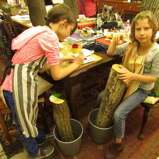
Rachel and Ashleigh hard at work